UFit
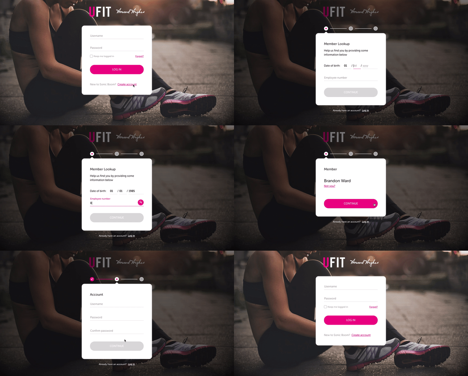
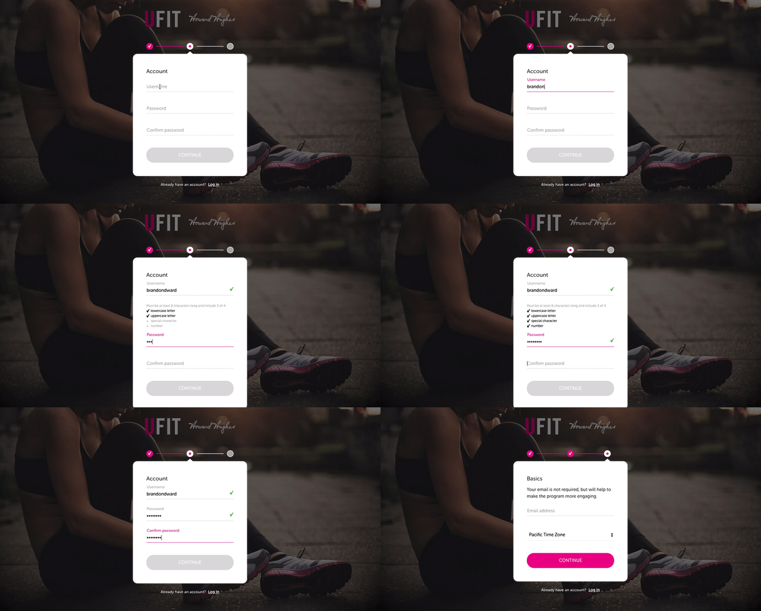
This prototype features a registration/signup flow for first-time users accessing an employee wellness portal. It's important to note that employees are assigned an ID number from their employer prior to creating an account. In this example, dots and animated lines above the form container illustrate a user’s progress. This provides a visual cue to let the user know when a step has been successfully completed.
Displaying feedback for complex password creation can be a challenge. It is always important when designing product interactions to show enough written instruction without showing too much instruction. Displaying critical information (i.e., password requirements) only when interacting with the associated text input will help deliver the optimal user experience.

