Sonic Boom
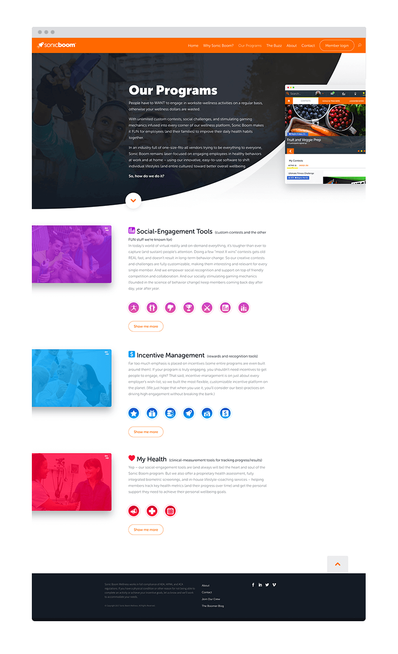
As a UI/UX designer at Sonic Boom, I was responsible for quite a few different aspects of the company's design strategy. While the majority of my time was spent focused on the customer-facing mobile app, I also had the pleasure of designing and building out their marketing site.Mobile App
The core mobile platform included a robust amount of content and functionality. Given its complexity, it was pivotal that all interactions were both intuitive and essential for delivering a user experience that customers had grown to expect. The examples here show several features that were at the core of their digital products — empowering users to improve their lives through actionable challenges and share their experiences while doing so.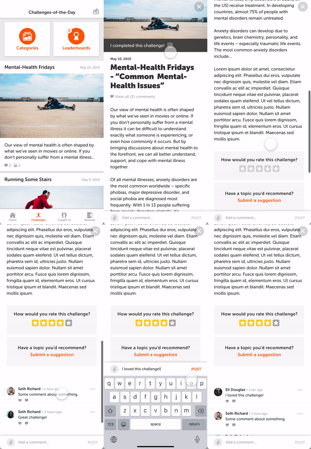

Marketing Site
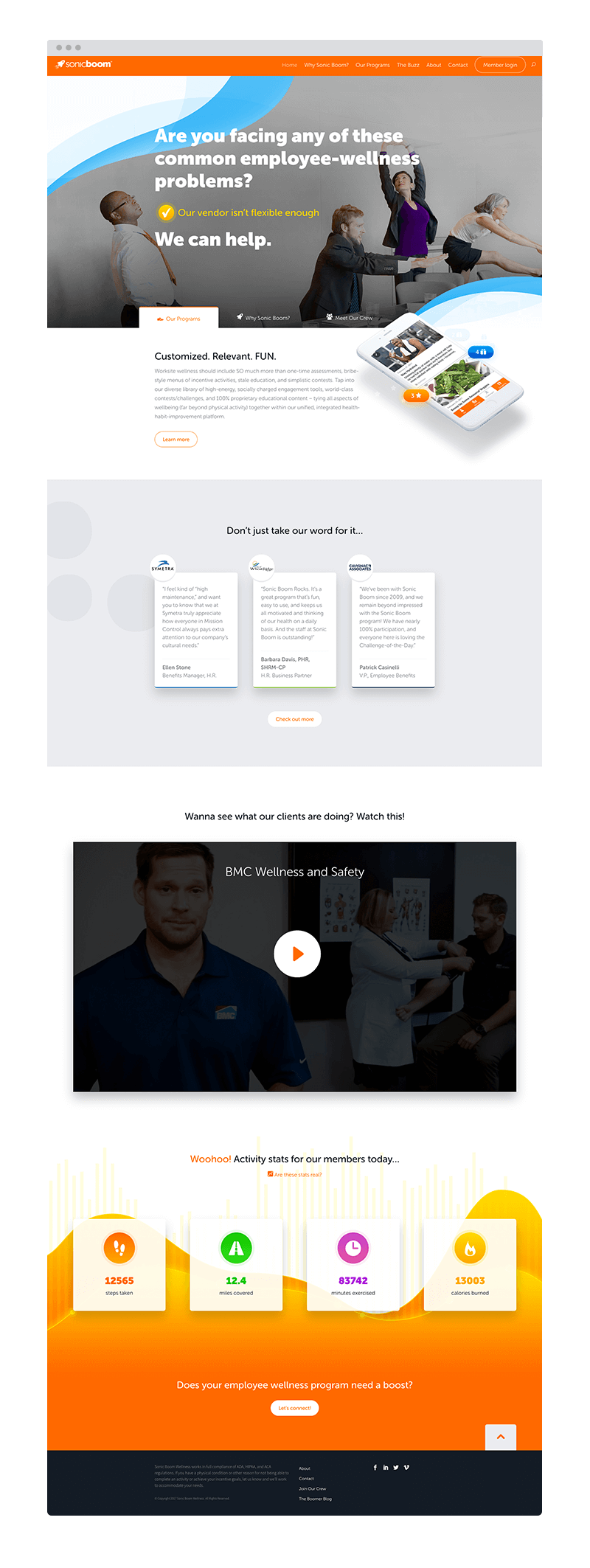
This was a project that required a lot of moving pieces. It's a site built with WordPress, but has a lot of custom elements involved. First of all, it was designed to compliment Sonic Boom's mobile app. We wanted to adhere to the design system that was initially put in place, but also present fresh content and aesthetics for marketing purposes. From a design/development perspective — it needed to stand out competitively in the wellbeing marketplace.View it livechevron_right
Design foundation
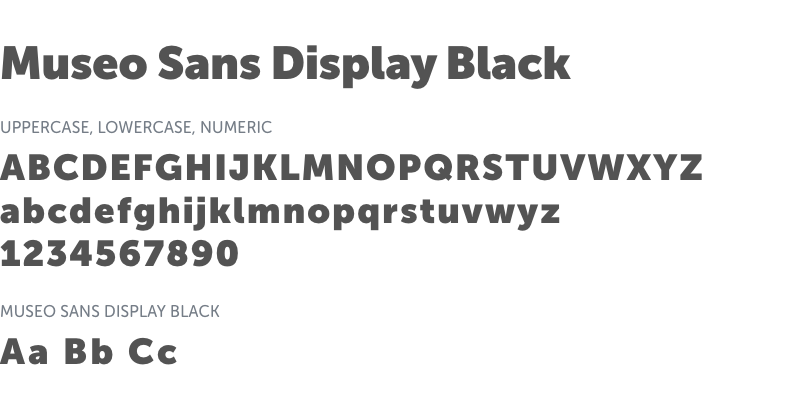
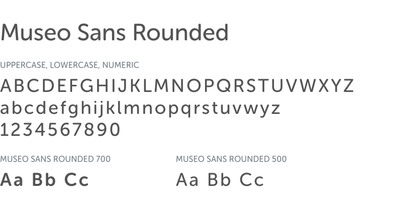
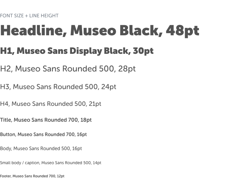
FontsThe Sonic Boom marketing site required some bold and approachable fonts. The Museo font family was the perfect match to represent the brand's UI. It represented a strong characteristic that aligned well with the colorful appearance.
Colors
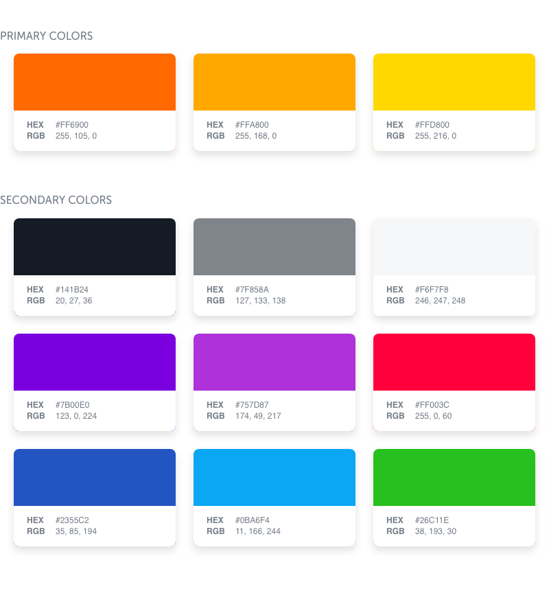
The primary and secondary colors seem to speak for themselves. They're bright and fun without being too hard on the eyes.
The primary and secondary colors seem to speak for themselves. They're bright and fun without being too hard on the eyes.
Development strategy
You'll notice that the copy used throughout the site has a uniquely playful attitude, yet professional presentation. My main focus was to mirror that voice with respective imagery and interactions. It was also important to guide users through the content with deliberately placed calls-to-action.